
If you are currently following a ketogenic diet, also called keto, then you have probably…
Reunion Drops the Island, Rebrands as Reunion Coffee Roasters

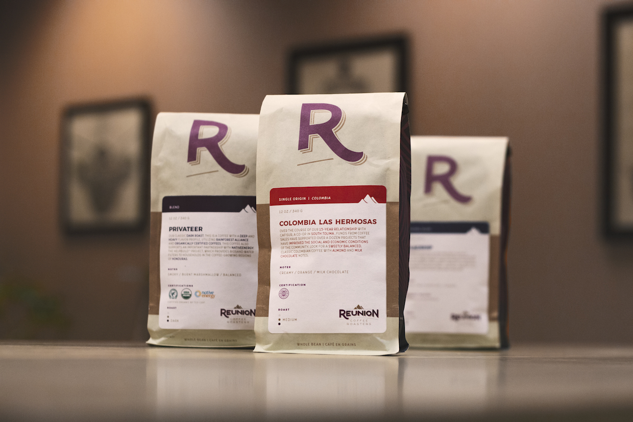
Reunion Coffee Roasters’ new bags. All images courtesy of Reunion Coffee Roasters.
Ontario, Canada’s Reunion Coffee Roasters, formerly known as Reunion Island Coffee, has executed a complete rebranding to enhance its social mission while eliminating island-related confusion among customers.
Founded 24 years ago by Canadian coffee professional Peter Pesce, the company became a certified B Corporation two years prior to being named Roast magazine’s 2015 Roaster of the Year.

Day-to-day operations of the company — which currently has two cafes in addition to its Oakville, Ontario, roastery — are now overseen by Adam Pesce. The younger Pesce told Daily Coffee News that the original name for the company was derived from the island off Madagascar where French missionaries introduced the bourbon variety from Yemen in the 1700s. While an interesting historical reference, the name at times caused more confusion than curiosity.
“We are a Canadian company and we want to continue to be a Canadian brand. The word ‘island’ was just confusing,” Adam Pesce said. “We wanted more focus on the social aspect of coffee instead of the idiosyncratic story of coffee.”

The Reunion Coffee team took the name change as an opportunity to refresh the brand from top to bottom, although part of the challenge was not to disregard nearly a quarter century of brand loyalty.
“We really wanted to lean into the idea of a heritage brand, because we’ve always been able to maintain consistency from a quality standpoint and a customer service standpoint,” Pesce said. “We have all the hallmarks of what you would consider a heritage brand in the specialty coffee [industry].”
For the project, the company enlisted the help of the Toronto-based firm BlackJet along with its own in-house designer, Josh Little. The result is a new “R” logo placed prominently on Reunion’s bags, and a mountain logo online and on other printed pieces.

“Our customers and staff have been loving the ‘R’ logo and it’s quickly becoming our favorite icon for Reunion,” Pesce said. “I’m also a huge baseball fan and the ‘R’ sort of resembles an old school baseball logo, which I love.”
Building upon colors established by the previous Reunion Island look, the scheme now includes a burgundy designed to recall the deep red of a ripe bourbon cherry, a beige to recall green coffee in parchment, and light oranges and yellows to reflect the crema of espresso.
An even bolder look for the brand is displayed through its new cold brew and tonic cans, created in collaboration with Toronto cold brew brand and private label beverage company Station Cold Brew.

“The response for our rebrand has been great,” Pesce said. “Now we’re going to really focus on our core competencies like roasting and serving great coffee to our customers.”
Related Reading
Craig Batory
Craig Batory is a writer, marketer, and coffee professional working and
living in Detroit.


Related Posts